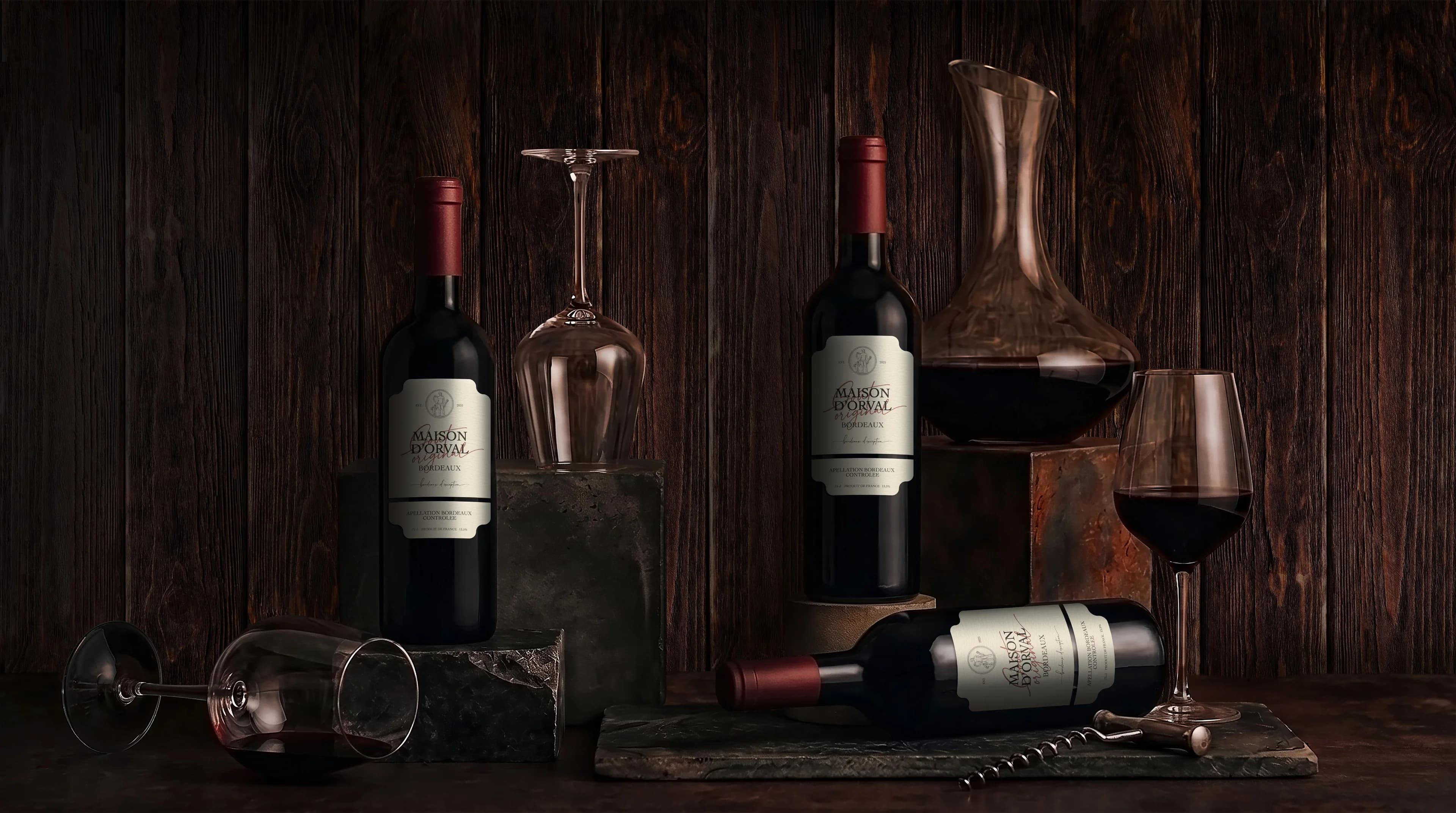
RED WINE
Packaging Design • Illustration • Branding
A red from Bordeaux — accessible premium. Maison d'Orval had to stay true to tradition and, within it, earn a face of its own: the kind people pick off the shelf and remember.
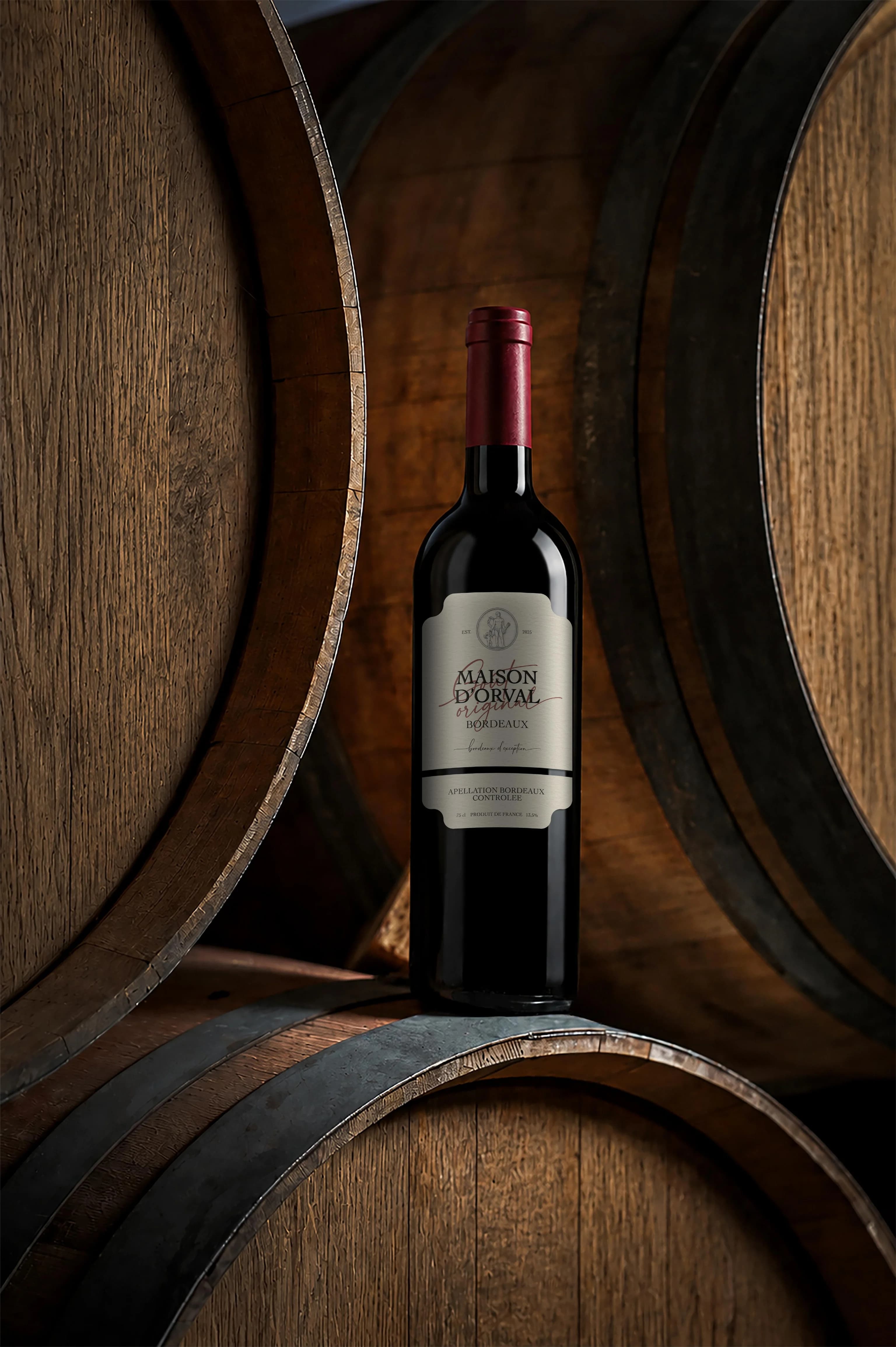
At the heart of the label — an engraved medallion of Mercury, the ancient god of trade, roads and prosperity. Bordeaux was built on wine and its port, on exchange and the movement of goods — so the allegory here isn't decoration, it's meaning: every bottle is about the journey, the deal, the gain. An aged texture, a fine rule and a handwritten signature over a classic serif — the Bordeaux tradition, read anew.
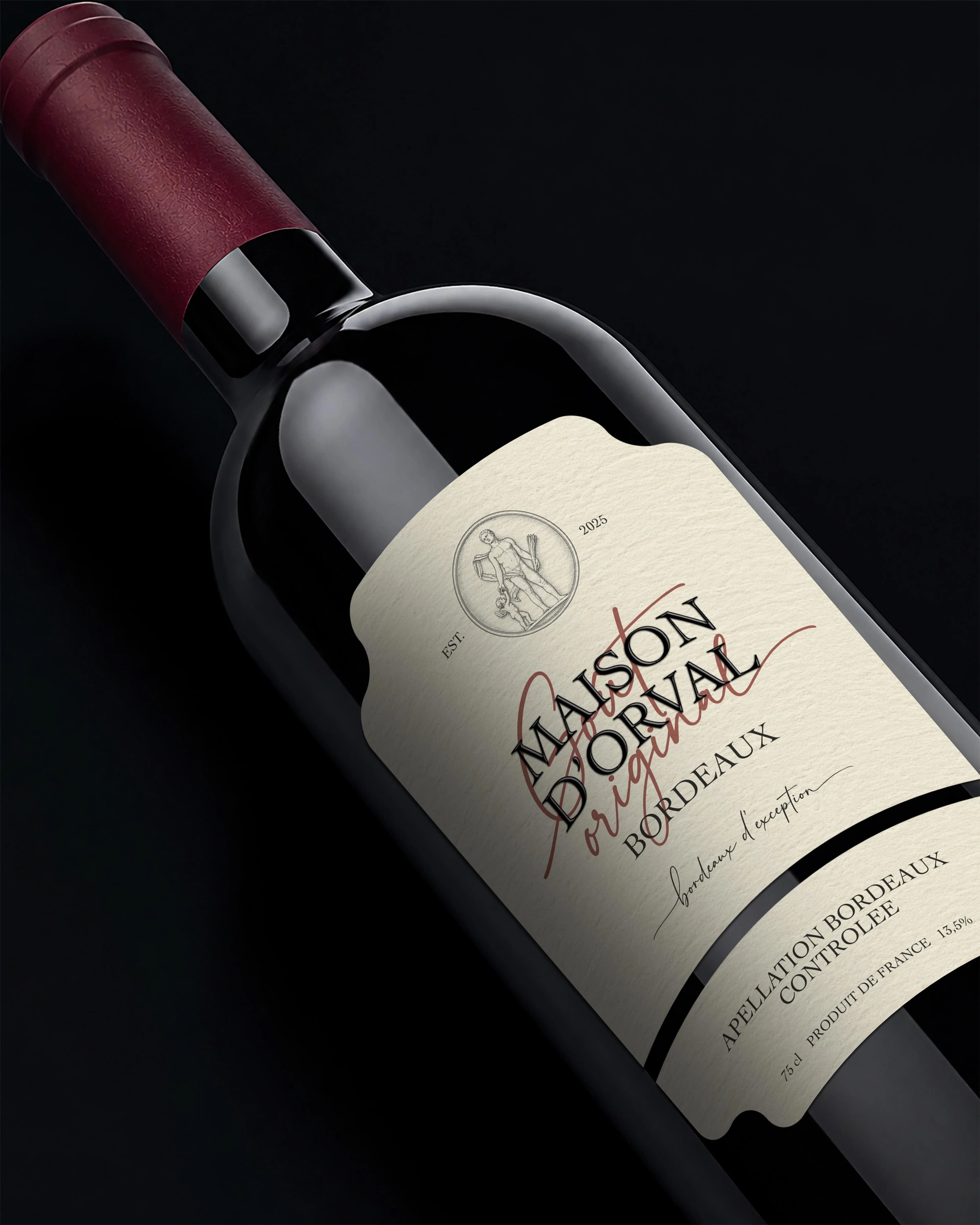
Recognised among a dozen Bordeaux neighbours. Opened for the occasion, given as a gift. The label gave the wine what the category had all but lost — a reason to choose this one.
A shelf of reds — a thousand of the same. Give a reason to pick yours